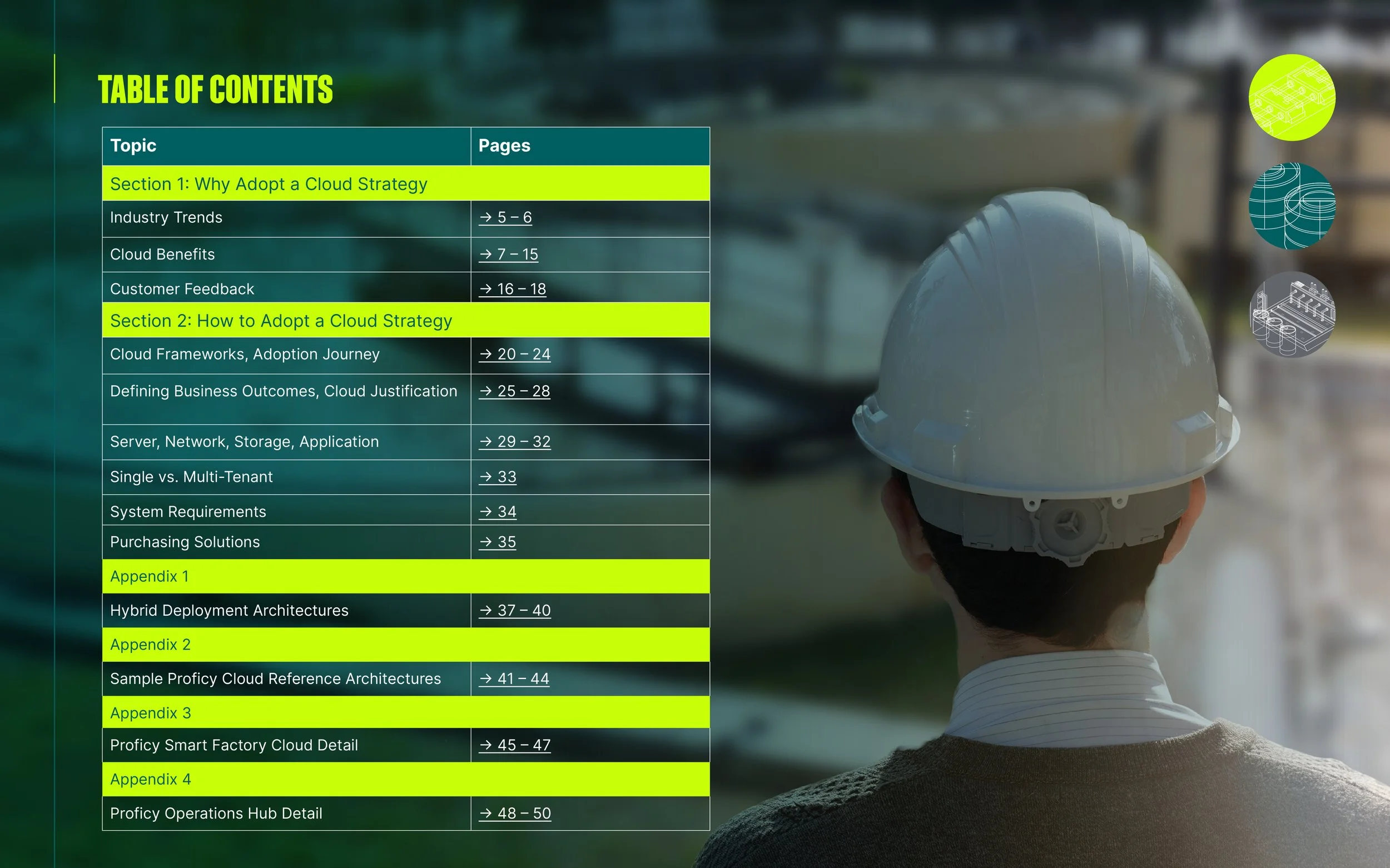
GE Vernova Brochure
This billboard and 52-page brochure was developed for GE Vernova as part of a comprehensive visual communications initiative. From the outset, the focus was on clarity, cohesion, and compelling storytelling—principles that guided the structure, tone, and overall design.
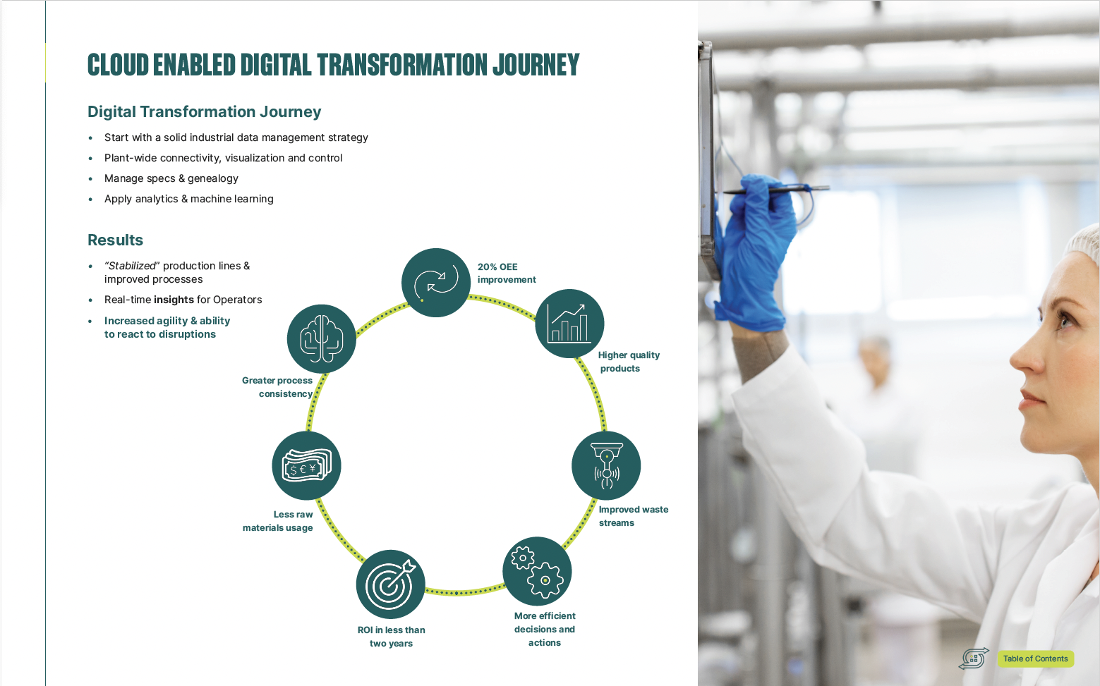
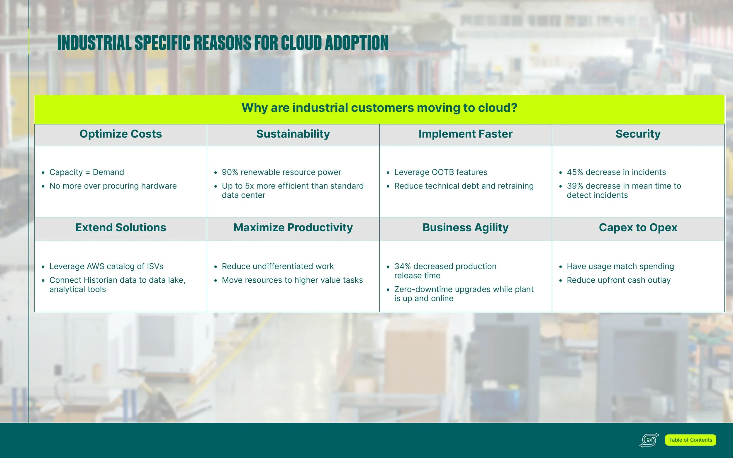
The brochure integrates a wide array of infographics and dynamic chart designs, each crafted to simplify complex information while maintaining visual interest. I employed a thoughtful approach to information design and content hierarchy, using principles of typography, color theory, and layout design to ensure every spread communicated effectively. Design systems were built to support consistency across pages, while allowing for creative flexibility where needed.
Each section flows intuitively into the next, creating a seamless user experience that reinforces the narrative arc of the content. The work reflects a balance of visual hierarchy, branding, and design thinking, resulting in a piece that is as functional as it is visually engaging. The images shown here represent just a small portion of the full brochure, which served as a key piece of marketing collateral in GE Vernova’s broader communications strategy.