GE Vernova Aerospace Infographic
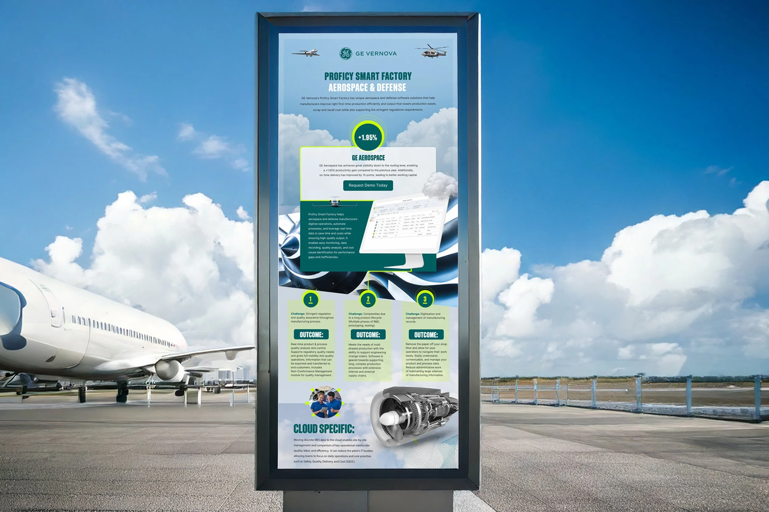
I designed this infographic for GE Vernova Aerospace, focusing on data visualization to ensure the complex content was easily understood. My goal was to create a piece that not only conveyed the information clearly but also engaged the audience through effective visual storytelling. The layout design was meticulously crafted, utilizing information hierarchy to guide the viewer through the data in a seamlessly.
Given the detailed nature of the content, I paid special attention to typography and color theory while enhancing the brand identity of GE Vernova. The user experience (UX) was a top priority, ensuring the design was both intuitive and visually appealing. By focusing on visual hierarchy and interactive design elements, I ensured that the final piece delivered a clear and compelling narrative, highlighting the key data without overwhelming the viewer. The result was a polished and effective digital design that met both aesthetic and functional goals.

Every great infographic begins with a spark of creativity! This is the initial sketch of my very first infographic concept.